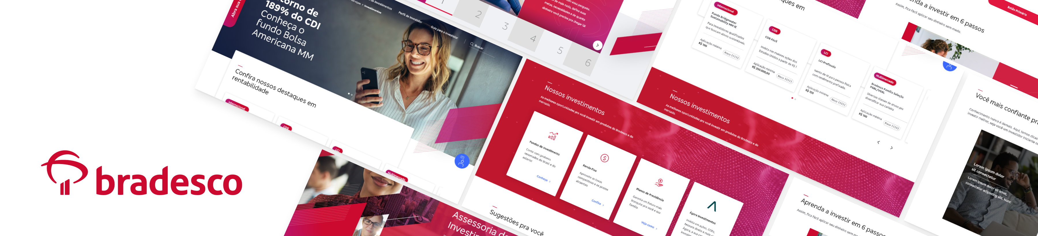
Investment portal Redesigning to improve clarity and confidence
Bradesco’s investment portal offered many products, but many clients still felt unsure about what each option meant or how to choose between them. I redesigned the experience to make investment options easier to understand, easier to compare, and easier to act on with confidence.
Overview
Role: Lead UX / Product Designer
Team: Product, Engineering, Business, Compliance
Timeline: 1 year
Problem: Clients struggled to understand investment differences and decide where to invest
Solution: A clearer, more guided investment experience built around education and decision support
Impact: Improved clarity, reduced cognitive friction, and made investment choices easier to navigate
My Role
- Led the end-to-end redesign of the investment portal
- Reframed the experience from product listing to decision support
- Defined clearer information hierarchy and educational UX patterns
- Designed flows, wireframes, UI, and prototypes
- Worked closely with engineering and stakeholders to balance usability, business goals, and compliance requirements
The Problem
The original experience gave clients access to many investment products, but it did not do enough to help them understand what those products meant.
Users often had trouble answering simple but critical questions:
- What is the difference between these investment options?
- Which products are lower risk?
- Which ones are better for short-term or long-term goals?
- Where should I invest if I’m not an expert?
Instead of supporting decisions, the portal often felt dense, technical, and difficult to compare. That friction made investing feel more intimidating than it needed to be.
Key Insights
- Clients didn’t need more product information — they needed clearer guidance
- Too many options without explanation increased hesitation
- Comparison only works when people understand the criteria behind it
- Many users were not struggling because they lacked interest — they were struggling because the portal assumed they already understood how to evaluate investments
- Good investment UX is not just about showing products — it’s about helping people decide
Approach
User Understanding
Reviewed the portal experience through the lens of real client decision-making, identifying where confusion, hesitation, and overload were happening across the journey.
Problem Framing
Reframed the core problem from “how do we present more investments?” to “how do we help clients understand which investment fits them?”
Experience Strategy
Built the redesign around three principles:
- Explain clearly
Help users with less investing experience
- Compare meaningfully
Surface the differences that actually matter when making a decision
- Guide with confidence
Support users from exploration to action without overwhelming them
Before vs After
A shift from a product-heavy portal to a more guided and understandable investment experience.
Solution
Cleaner investment architecture
I restructured the portal so users could navigate investment categories more easily and understand what each option was designed for.
This made the portal feel less like a crowded catalog and more like a guided investment experience.
Built-in education
A major part of the redesign was helping clients learn while they explored.
I introduced clearer explanations and contextual guidance around key concepts such as:
- risk level
- liquidity
- return expectations
- time horizon
- investor profile fit
I added contextual explanations and simplified content patterns to clarify risk, liquidity, time horizon, and expected returns directly in the browsing flow, so users did not need to leave the experience to interpret financial terms.


Better comparison experience
I reorganized comparison views to highlight the attributes users cared about most when deciding — such as risk level, liquidity, and investment horizon — making tradeoffs easier to scan side by side.
Cleaner data visualization
I simplified the visual presentation of financial information to make the interface easier to read and more trustworthy.
Complex data became more digestible, and the overall experience felt less overwhelming — especially for users with lower investment familiarity.
Final Product Experience
The final experience shifted the portal from a dense product catalog into a more guided investment journey. Instead of asking users to decode financial products on their own, the interface helped them understand categories, compare options more meaningfully, and move toward decisions with greater confidence.
Key Takeaways
This project reinforced an important principle for me:
When people are making financial decisions, clarity is not a nice-to-have — it is the product.
What made this project valuable was not just improving the interface, but making the experience more educational, more supportive, and more usable for real decision-making.
Impact
- Reduced friction in understanding investment options
- Improved clarity for users with lower investment familiarity
- Shifted the experience from product-first browsing to guided decision-making
- Made the portal feel more approachable, educational, and trustworthy
- Created a stronger foundation for future growth and product evolution