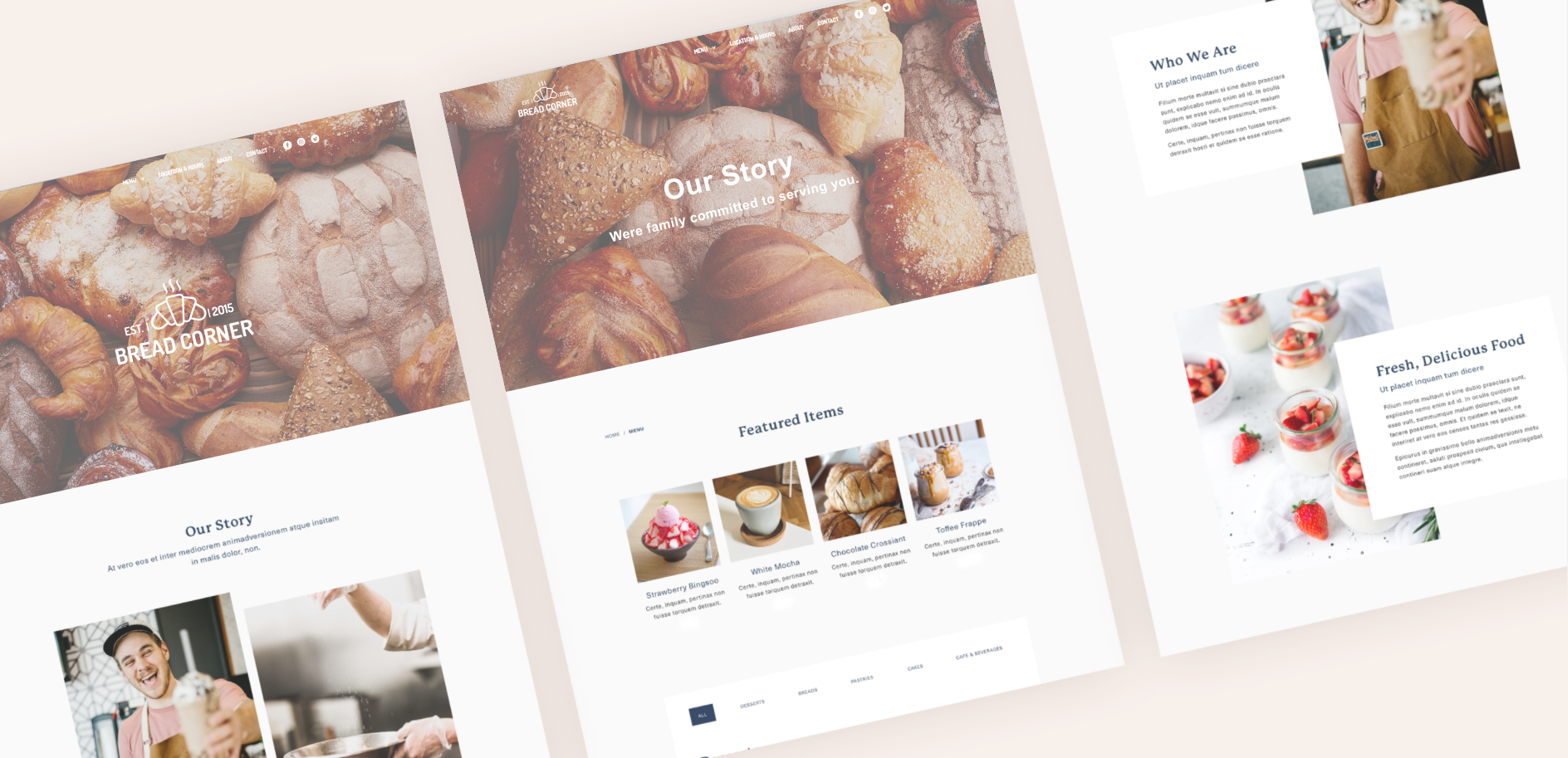
Project Overview
Challenge
Bread Corner is a small, family owned and operated Bakery Cafe. They currently rely on social platforms such as Facebook, and Instagram, however, they have potential to build their online presence and grow their business with a new website.
Objectives
Design a website that meets the goals of the business and user
New branding that effectively communicates Bread Corner's unique personality
Project Scope
New website and branding
Role
UX Research
UX Design
UI Design & Prototyping
Wireframes
Prototyping
Design Process

Research
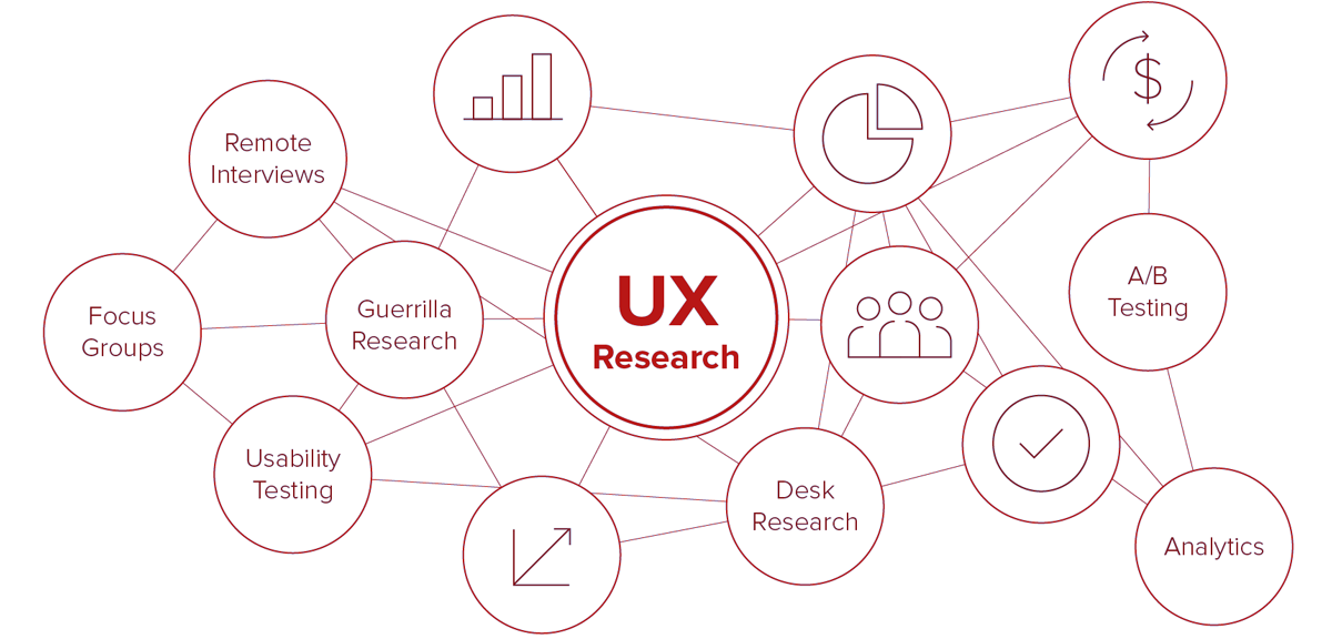
Through market research, competitive analysis, and user interviews, I set out gain a deeper understanding of the market and Bread Corner’s customers. which enables me to dig deep into my understanding of the customers - not only their immediate frustrations, but also their hopes, fears, abilities, limitations, reasoning, and goals. It lays essential foundations for creating solutions in later stages.
To ensure the research stays on track and better guide design later, it is important to create a research plan before diving into the research phase. I listed research goals, research questions, assumptions, methodologies, participants, and timeline.
Research Goals
- Understand the market trends of the Bakery/Cafe industry
- Identify the target market
- Identify the competitors and evaluate strengths and weaknesses
- Understand how people discover new, local businesses
- Understand the experiences people have online and offline
- Discover pain points that people encounter online and offline
User Interviews
- How often do you visit bakery cafes?
- Tell me about how you typically discover new local food businesses.
- What motivates you to try a new local food business?
- Why do you visit bakery cafes?
- What factors influence your decision on which bakery cafe to visit?
- Tell me about your most recent experience at a bakery cafe.
Empathy Map
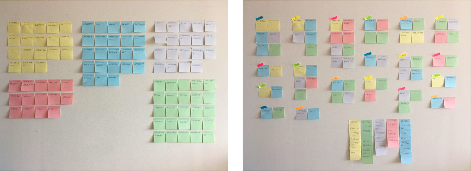
Using an empathy map, I synthesized all the information I gathered during the user interviews to uncover key insights that led to identifying target user group.
First, I started by categorizing my notes into the categories of Doing, Thinking-Feeling, Seeing, Hearing, Gains, and Pains to get an overall understanding of everything learned during my interviews with the different participants.
This helped me to uncover common patterns that led to key insights which would help me identify what our users’ needs truly are.
Persona
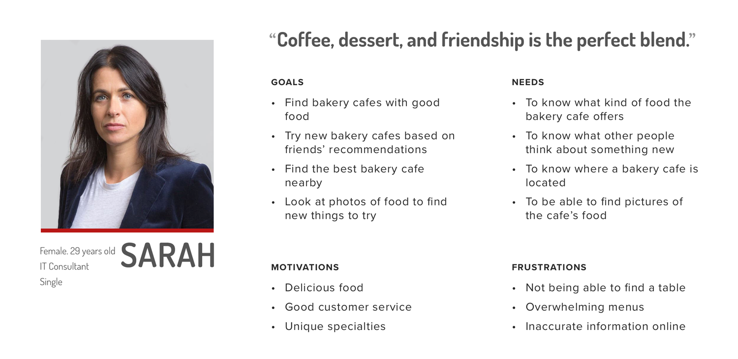
Through my research, I was able to get a clear picture of who the target users are and created a persona that would represent them through - meet Sarah. This persona continued to guide my decisions moving forward, making sure my design is centered on who our user Sarah is.
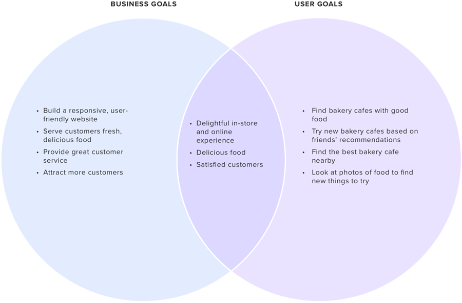
Project Goals
Before I could make any decisions on what kind of solutions we wanted to implement, I needed to have a clear understanding of the goals we are trying to meet. These goals would help guide the decisions made moving forward to ensure we are moving towards the right direction.
Mid-Fidelity Wireframes
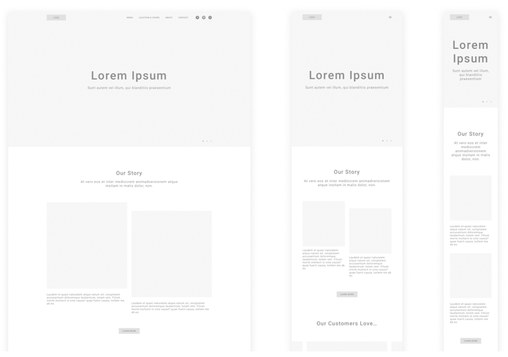
Taking the lo-fi wireframe sketches, I digitized them on Sketch and added just enough information for users to be able to navigate through the pages and complete tasks I would present to them during usability testing. These mid-fidelity wireframes would help my focus on what needed to be improved in terms of the functionality of my design. I also created tablet and mobile versions to make sure that the design is responsive and effective across the different device screens that users would be accessing the website on.
Usability Testing
With my prototype completed, I started working on a test plan to guide the testing that would be conducted. I then recruited participants and conducted usability testing in order to see how users interact with my design and identify where improvements to the design can be made.
Test Objectives
- Test if users can easily complete the tasks
- Observe the different paths users take to complete tasks
- Assess areas of improvement to improve the usability of the design
Tasks
We asked the participants to complete tasks such as:
- Learn more about Bread Corner background.
- Find out where Bread Corner is located.
- See what kind of products Bread Corner offers.
Summary
We conducted testing with 5 participants to made observations on how they interacted with the prototype and completed the tasks.
- Method: Remote, moderated usability testing (Think Aloud)
- Participants: 5
- Age: 25-30 years
- Average Time: 7 minutes
- Task Completion Rate: 100%
- Error-Free Rate: 99.4%
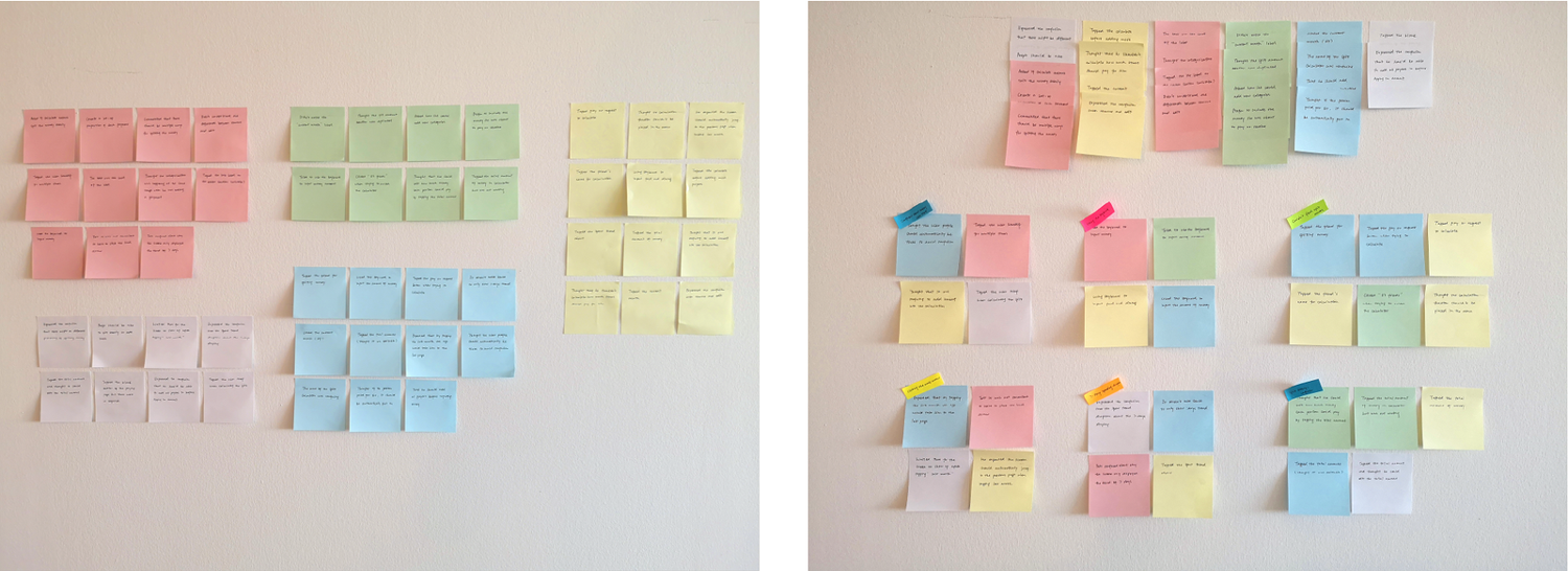
To get a better understanding of all the observations from testing, I used an affinity map to synthesize my findings. This helped me to get a better look at the different experiences users had and allowed draw connections and uncover key insights. These insights would help me identify what improvements would need to be made on our design to make sure we are helping our users painlessly meet their goals.
Final Prototype
I explored a new approach for this project by testing mid-fidelity designs to put a focus more on the logical structure and design before finalizing the visual design. I think this method was really effective in quickly identifying initial roadblocks to our user’s goals in the design and to make sure that the overall layout of content itself is effective and functional.
